
Gido. Plant Based Cuisine
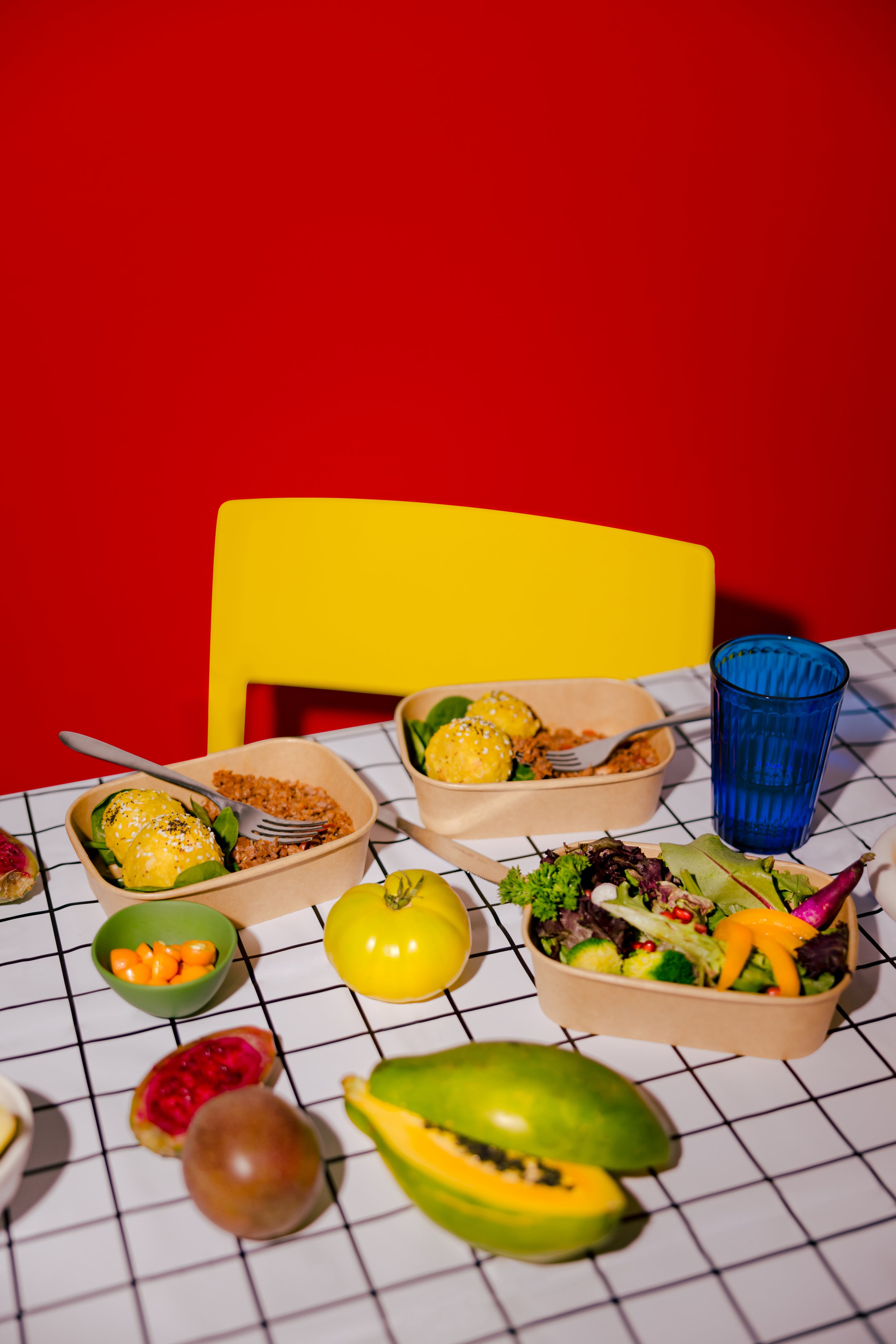
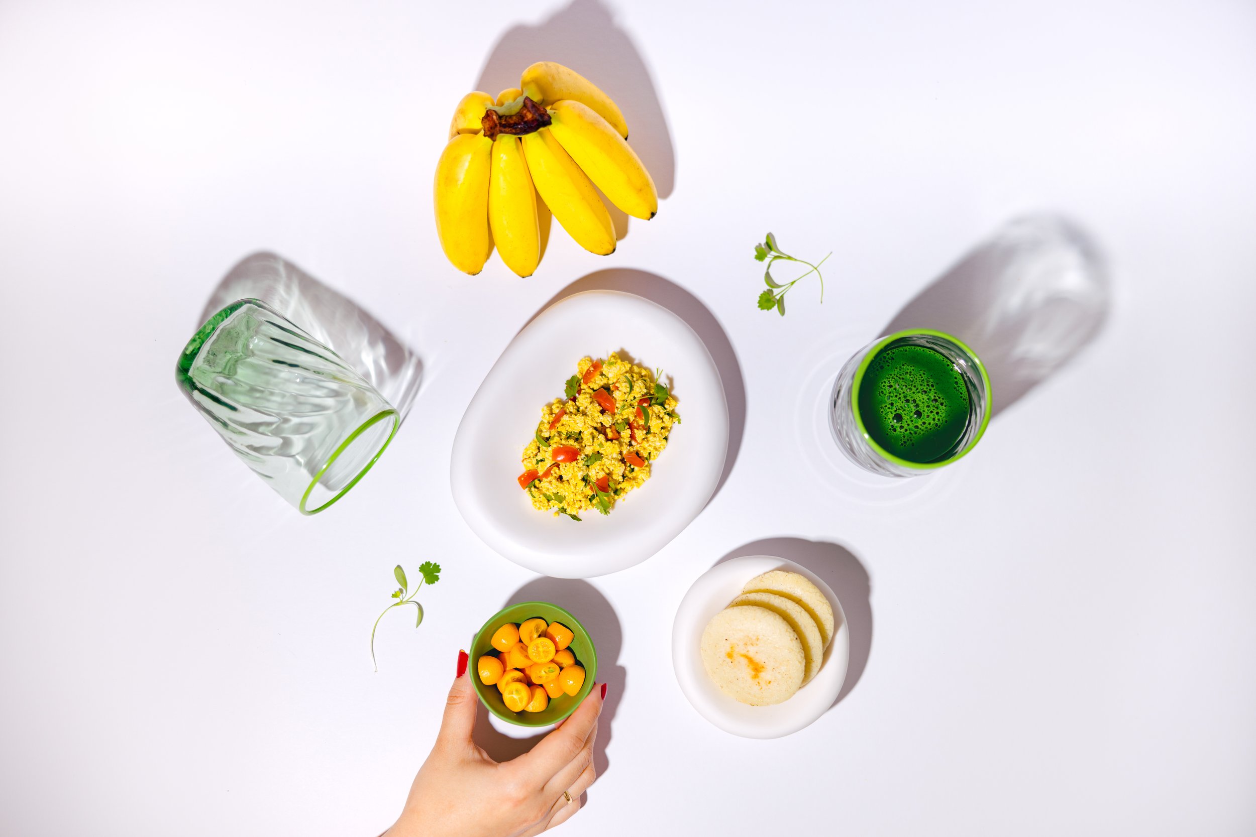
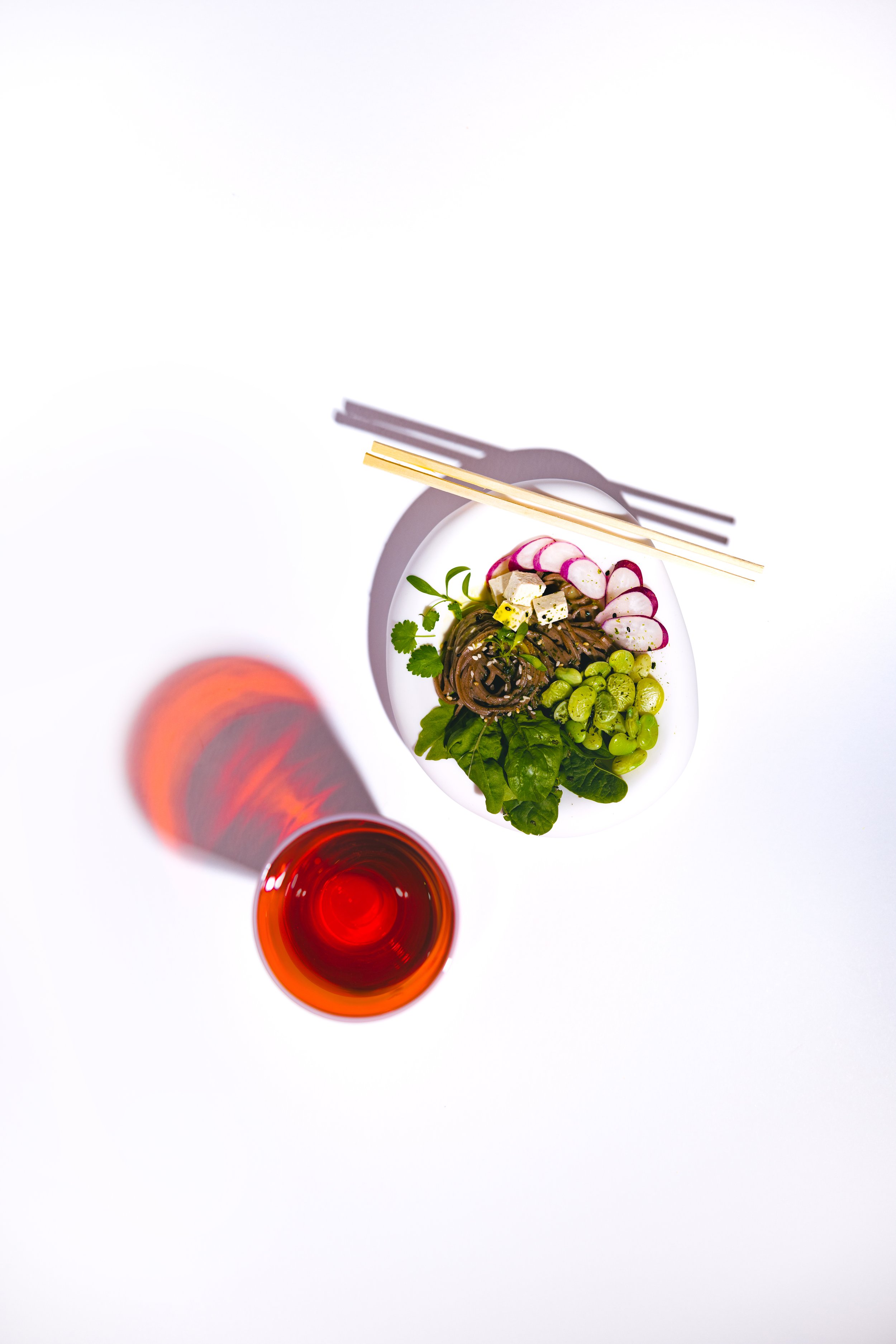
Branding & Product Photo shoot
Inspired by the culture of Venezuelan indigenous tribes, Gido aims to connect ancestral knowledge with the present by offering plant-based products that truly connect with Mother Earth. It is adventurous, ecological, holistic, and vibrant. As a brand rooted in indigenous heritage, energetic, circular, and adventurous, we have developed an eclectic identity that sets it apart from others in its industry.

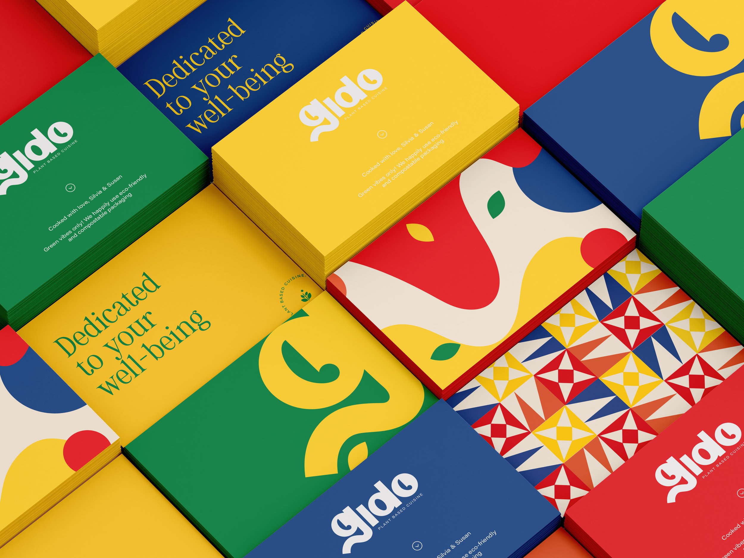
The letter G is our shining element. Gido means green; the typography was designed by me from scratch, very geometric and with striking curves.
It is a brand that helps individuals venture into circular and healing alternatives with complete freedom. It represents a young, joyful, and trend-conscious artisanal community; therefore, including curves in the design was very representative.


